Code For America: SB County Public Defender's Office App

My Role
Lead UX Designer and Researcher serving in a 9 month Fellowship Program alongside two developers. Successfully shipped product.
Background
Santa Barbara County Public Defender's office seeks a way to better serve the justice-impacted community. Resources for this community are silos throughout the county and are often inaccessible. Santa Barbara County currently experiences a high rate of recidivism and an unheard of justice impacted community due to the stereotype of the Santa Barbara paradise. The Santa Barbara Public Defender's hopes to reduce recidivism and allow resources to be more accessible to the justice-impacted community by working alongside Code For America Community Fellows in order to build an app.
Problem Statement
How might we improve the lives of the Justice Impacted Community and reduce recidivism in Santa Barbara County?
The User
In order to properly reflect the needs, motivations and goals of the justice impacted community I used a human centered design approach to solve this problem. I constantly was building, measuring and learning about the clients and the community rather than making assumptions of their needs. I conducted over 40 interviews with users to ensure their needs were met. Throughout this project my team and I would iterate after every sprint cycle and used human centered design as a guiding principle.
Success Metrics
-Decreased recidivism in Santa Barbara County by 62%
-Identified an internal structural issue in the full service in the SB Public Defender's Office in their case management software
-Decreased amount of time it took for Public Defender's (business) to divert client from entering jail by 48 hours, thus the client was able to divert a sentence entirely and was offered programs/treatment vs incarceration.
-Increased partnership between non-profits in SB County in order to serve their clients
-Gave a voice to the most unheard population by hosting a product launch & resource fair
Discovery
Research I served at the lead UX researcher, for this project and facilitated all workshops, focus groups and discussions that were needed to complete the deliverables. I mentored and guided my two developers in this area as well. All research was done in a remote setting. Research was crucial as it ultimately allowed me to define the correct problem to solve for and present those findings to our government partners.
Observation of SB County Probation Office: First I wanted to understand the current problem to help provide a product that would be useful. Upon a visit to the SB County Probation Office we found a board of flyers with the various resources that are available in the county . Below you will see that much of the information needs to be updated with pencil, there are multiple flyers over one another that hide the information that is needed and it can all be very overwhelming and leads to the problem at hand.

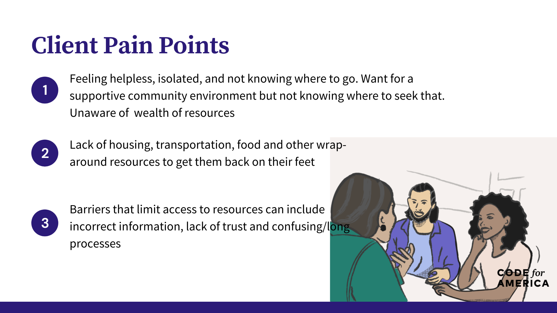
Methodology I used both qualitative and quantitative methods in order to conduct this research. In all methods, convenience sampling will be used in order to meet the time constraints of the population. I led, organized and executed 40 qualitative interviews with those that were from the Justice-Impacted community. Through the interview process we found these major paint points:

Our government stakeholders were very concerned on how we can set ourselves apart from the current tool, 211. This is a nationwide service that seeks to provide folks with support over the phone. Through our positioning statement we were able to leverage our partners in ensuring that we would set Thrive apart.

Journey Maps From the interviews above I was able to start formulating a client journey map. First below you will find a sketch of the process and the many touch points that a client may come in contact with during their reentry process.

After drafting this out the photo below indicated the final journey map process that clients can go through. With this journey we are better able to understand the places and opportunities where technology and this app can best fit into a client’s journey.

Opportunities: The biggest opportunity for technology to help this population lies in the amount of time after a client is released. After a client is released, our research showed that the first 3- 6 months are critical in the success or failure of reentry. If a client can not find resources, or find a community of support they may be tempted to fall back into old habits. Through offering them this application and resource prior to re-entry, they will be able to come up with a re-entry plan. Currently, clients are directed to use the 211 app which is a county website of resources. However, this resource does not fit the needs of the 211 app because it lacks the details that are needed for the justice-impacted community.
A major pivot
Upon further research of the problem, I found that yes, the research shows that resources are deeply needed in Santa Barbara County, however some of the major pain points were within the government office itself. While interviewing with community based organizations as seen below we found that a major pain point was for the social workers, attorneys and community based organizations to get a definitive answer to help assist their client.

This quote above illustrates the major pain point. The people helping our end user were in fact in a deep need of assistance as well. They were left with more questions then answers when trying to seek resources to refer their clients.
Gap in Service: If an attorney needed to help a client gain access to a resource they would either text or call a social worker within the office. If the social worker was unavailable they would need to send an email. As the social workers caseload began to increase this request for resource guidance and help would sit idle on their inbox or phone. I learned that the problem we were solving for had an added layer --- How can we best support attorneys as they help provide resources to their clients to help eliminate an added barrier of waiting for a social worker's assistance?

The county of Santa Barbara has a program called diversion which is a grant funding program that allows for clients to divert from jail or prison into a resource like treatment court that specializes in getting someone services they need vs booking them into jail. This program is incredibly successful and provides a holistic approach to treatment, as long as someone can get access to this type of program. A major barrier to access is the ability to contact the provider.

The Big Pivot: What the service design maps showed me as a designer was that I needed to pivot in who I was making the app for. Now, with Thrive attorneys and social workers have the opportunity to use this app to best support their clients and their needs. With an increased understanding of the problem at hand, I was able to move forward in the design process and included this new user group in our population.
Design
Design Workshop with Government Stakeholders
After presenting the service map to SB Public Defender's Office, I was able to hold a remote workshop where we together mapped out how a client may use this site to gain resources. Doing this workshop was very helpful as it showed the biggest barrier to re-entry which actually was present within the Public Defender Office themselves. I wanted to seek a better understanding how client's could navigate the tool we were building based on their own personal circumstances.

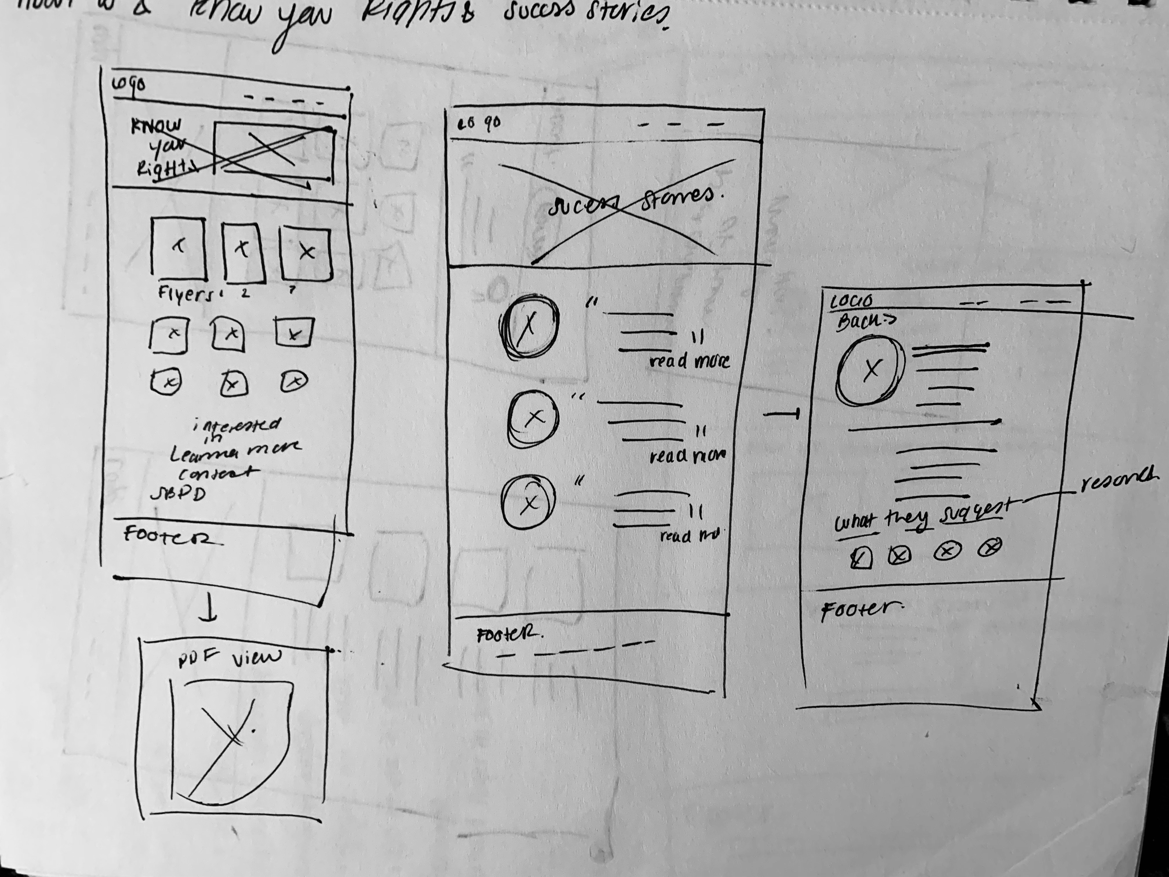
From this user flow I was able to start making rough sketches of what a tool might look like that would allow people to find resources, but to also gain other important community information like knowing their rights and being connected with folks in the community who had re-entered.

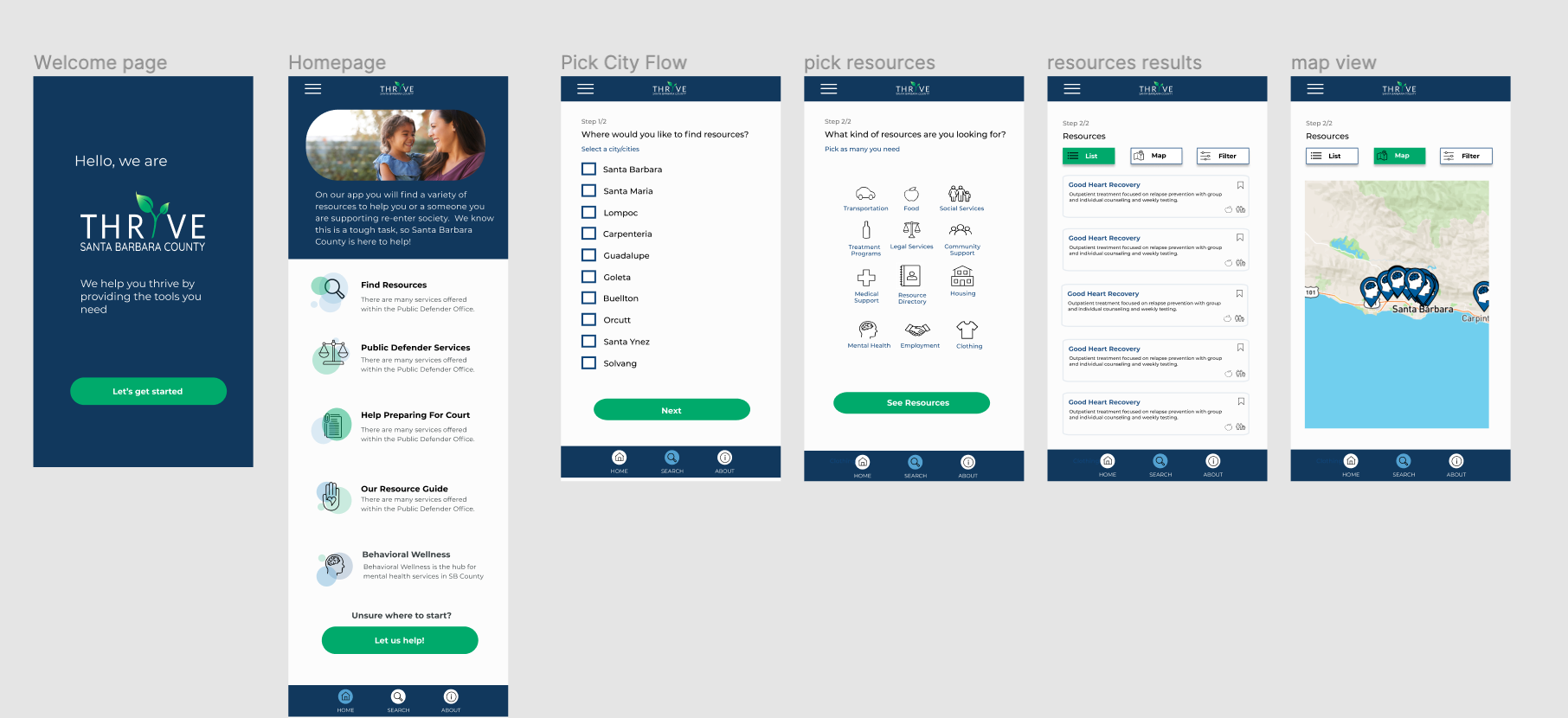
Wireframes: A majority of our users do not have English as their first language and or a reading level of a 5th grader. With this in mind most of the app has a learnable UI. As you can see I decided to use iconography as a way to indicate ideas and words. One of the major issues I was facing as a designer was how to illustrate the many needs of our users.
After presenting this to our government partners, now came the next task of building out these wireframes. This flow below shows some of the initial mapping that took place. In my research I found that information was overwhelming, so using iconography and a "resource hub" was the best way to help people feel in control.
.png)
Information Architecture: My team and I spent over 30+ hours inputting data from each of the service providers and community based orgs on our backend database. For our MVP we used the service Airtable as we waited for access from our partners into their backend. Taking all of this complex data and finding a way to make it seamless was one of the challenges of my design.
Logo Iteration Words and tone that logo should evoke: Motivating, Encourage, Guidance, Trust and Hope
There were several logo variations that are shown below. I used the community and stakeholder guidance in order to gain input on the several iterations we had. Initially our app was called Fresh Start, then after we decided it would be better suited to re-brand the name to Thrive after doing several focus groups.

Usability testing and iteration : I was able to recruit and conduct potential users who meet the demographic needs of our target population. After completing 20 remote usability tests, I found that users were able to navigate through all tasks with a 85% completion rate. Users found the app easy to search through and were excited about the potential impact this would have on the Santa Barbara Community.

Through testing, we were able to find that some of the language in the app could be viewed as problematic off putting to someone who has been just released from Jail/Prison. For example saying something like Substance Use and using an icon of a martini glass and pill could be off putting. It was extremely helpful to test the justice impacted community themselves in order to hear any shortcomings we might have not seen. You can see that change illustrated in the wireframes below.

I was also able to take lead on many product manager roles like overseeing our road map, leading meetings and leveraging strategy with our government stakeholders.
Impact
Beyond the Product :Technology was not going to solve the full scope of the problem. My team and I planned a virtual resource fair in order to promote the product but also to allow a space for community based organizations and the justice impacted population to meet and seek support. The fair was successful with over 45 people in attendance, and 93% of Community Based Organizations said they would strongly recommend the app to their clients.

Some Constraints: Working with government partners in a very bureaucratic system provided several constraints.The in depth filter process was not able to make it to the delivery stage as we were contrasted with the lack of in-depth data. Community based- orgs were unable to provide us with deep data needs like if they had live bed updates for housing shelters etc. To work around this we made a user flow that allowed users to identify some of their life circumstances and find resources based on that.
Serving in the civic- tech sector as a designer you can often be constrained by strict rules and regulation guidelines as for our scope of this project we were not allowed to collect PII. We were not interested in doing this as this data may be used for tracking purposes of folks that are on probation or parole.

Conclusion
In serving as the lead designer on this project I found that I was able to excel at gaining empathy for the user through researching their pain points as I have a family who has been justice-impacted. I was able to bring my passion for advocating for their needs and designing with a human centered lens. Through several iterations of the product and many pivots this product has been influential to Santa Barbara. You can check it out here at https://www.thrivesbc.com/
So did our app make an impact? This project started out as building an app but it become much more than that, through the design process I was able to present our research findings at workshops in order to advocate for those that have been justice-impacted. My research has helped push along several county initiatives in hopes to reduce recidivism and bring the narratives of the justice-impacted to the top of the agenda for our local government. Users who have used the app overwhelmingly have found a greater sense of belonging to the Santa Barbara Community and 92% of users would strongly recommend folks reentering society to use it. It was a true honor to serve as the designer for this projects.


